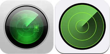
Apple today released an update for Find My iPhone, adding a newly redesigned iOS 7-style icon. The new icon was first introduced on the iCloud.com beta page, which was updated in mid-August with a new set of iOS 7 icons.
Old icon on left, new icon on right
It appears that the newest version of Find My iPhone may have been released prematurely, however, as the update gives an error message to anyone who attempts to use it without a registered developer account (paid or free).
The update, which also includes bug fixes, will likely be patched by Apple shortly. Until a fix is available, non-developers should avoid updating the app. While Find My Friends was also updated with bug fixes, it does not appear to include any design changes or errors that cause the app to be unusable.
Apple's iOS 7, which is currently available for developers, is expected to be released to the general public in September at the company's iPhone event.
Apple and Klarna are partnering on a new "Apple Upgrade" leasing program set to launch in the U.S. on Tuesday, July 28, according to Bloomberg's Mark Gurman.
The program will allow you to finance most iPhone, iPad, Mac, and Apple Watch models, with a 24-month term for iPhones and Apple Watches and a 36-month term for iPads and Macs. Customers will be able to pay off the device early during...
It is now mid-July, and that means the iPhone 18 Pro and iPhone 18 Pro Max are now just two months away. The devices are expected to look similar to the iPhone 17 Pro and iPhone 17 Pro Max, but there will still be many year-over-year changes, with rumored features including a smaller Dynamic Island, 5G via satellite, and more.
Apple is expected to unveil the iPhone 18 Pro, iPhone 18 Pro Max, ...
What is the opposite of progress?
Image (https://cdn.macrumors.com/article-new/2013/08/findmyiphone.jpg)
Regression!
As someone who has flown to Africa numerous times to try and find his lost iPhone, only to find out it was between the couch cushions the whole time, I welcome the new icon.
What is the point of high pixel density if you are going to turn everything into flat filled shapes and remove detail?
I am not saying I was a fan of making everything look like desktop notepads and felt lined tables, but I'm also not a fan of Microsoft's Metro look that uses 4 colors and boxes to represent a "modern" UI.
I mean if it wasn't for the rounded corners on the icons there would be no point for Retina because there would be no need for anti-aliasing.
Apple's first foldable iPhone, with a book-style design featuring a ~5.5-inch outer display and a ~7.8-inch inner display with a minimal crease down the middle.