Apple has released newly updated versions of the iOS iBooks and iTunes U apps, bringing a clean look and feel to the app and getting rid of the wooden bookshelf look that has been a hallmark of the app since it was released.
Other than the new design, the apps do not appear to have gained any new features.
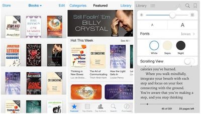
What's New in iBooks Version 3.2
iBooks has been updated with a beautiful new design for iOS 7.
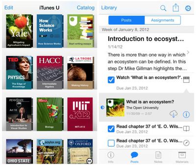
What's New in iTunes U Version 1.4
This version of iTunes U has been updated for iOS 7 with an all-new look and feel.
During WWDC 2025, Apple revealed that macOS 26 Tahoe would be the final major macOS version for Intel-based Macs.
macOS 27 will be compatible with Apple silicon Macs only, meaning that you will need a Mac with an M-series chip or a MacBook Neo with an A18 Pro chip in order to install the software update. Apple will unveil macOS 27 during its WWDC 2026 keynote this Monday, June 8, and the...
On an earnings call in late April, Apple's CEO Tim Cook said that customer response to the MacBook Neo was "off the charts," and the popularity of the laptop has reportedly led the company to significantly boost production.
Apple supply chain analyst Ming-Chi Kuo this week said he believes that MacBook Neo shipments to Apple were doubled from an initial target of 5 million units to 10...
Update: Since publication, new information has come to light suggesting the images have been AI-manipulated and are not in fact iPhone 18 Pro chassis parts. The original article follows.
The color options Apple is reportedly planning for the upcoming iPhone 18 Pro and iPhone 18 Pro Max have appeared online today in the form of images of chassis parts of unknown authenticity....
So, I've been pretty vocal in my career (I write iOS apps) as to how much I don't like the "deference" argument in iOS 7. I mean, look at how ugly that list view is? That list view in the right image (for the posts/assignments) is just awful. It doesn't look clean, or minimal. It seems cluttered and extremely noisy.
Am I the only one who thinks so? So many blue artifacts makes the use of the color pointless. You can select certain blue things. Certain blue things are just more blue indicating they are selected and some things have such a minimal use of blue that the only think you can do is just try tapping on everything with blue to see if anything happens. It's awful. Again, IMHO. :(
+1 for removing the goofy 2007-era wooden bookshelves
-1 for blinding white background
-1 for thin light blue text on white background
-1000 for replacing clean, instantly recognizable icons with disjointed text that must be read