Safari 15 has faced a barrage of complaints about its controversial new design, and while Apple has listened to user feedback and reversed some changes or made them optional, many users still struggle to discern an active tab from a background tab on the Mac browser because of the inverted shading.
Unfortunately for users who do not like the new design, Apple has not made any changes to the shading of tabs in either the Safari 15.1 beta or the latest version of the experimental Safari Technology Preview browser.
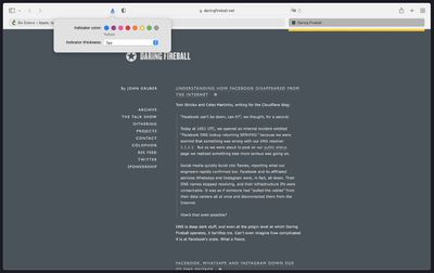
Fortunately however, developer Zhenyi Tan was inspired by John Gruber's Daring Fireballarticle about the issue and has since come up with a simple Safari extension called ActiveTab that provides a solution.
ActiveTab simply makes it easier to spot the active tab in Safari on Mac by drawing a line underneath it. There are eight colors to choose from, and the line below the tab can be customized to be between 1 and 7 pixels wide.
As Zhenyi notes, the extension works best with the "Separate" tab layout selected and "Show color in tab bar" disabled in the Tab section of Safari's Preferences. Zhenyi also cautions that ActiveTab will not work reliably if you have so many tabs in a window that the tab bar becomes scrollable.
ActiveTab is available for $1.99 on the Mac App Store, with no in-app purchases, no ads, and no tracking.
Bloomberg's Mark Gurman has high expectations for Apple's first foldable iPhone.
In his Power On newsletter today, he said the foldable iPhone will be "the most significant overhaul in the iPhone's history."
"iPhone 4, iPhone 6 and iPhone X were clearly a big deal, but this is a whole new design," he said.
Like Samsung's Galaxy Z Fold 7, the foldable iPhone will reportedly open up like ...
iOS 26.5 is now available for developers, and while it doesn't include any new Siri capabilities, there are some major changes for the European Union, and smaller tweaks for features available worldwide.
Suggested Places
In the Maps app, there's a new "Suggested Places" feature that recommends locations to visit based on trending places nearby and recent searches. When Apple launches ads in ...
Apple has been celebrating its upcoming 50th anniversary by hosting surprise performances and other events around the world over the past few weeks, and now Bloomberg's Mark Gurman has revealed details about the company's grand finale.
In a social media post, Gurman said Apple's celebrations will conclude this week with a finale at its Apple Park headquarters for employees.
A special...
Safari 14 tabs were a better UX design in every way: more attractive, more intuitive, more minimal, a more efficient use of available screen space, more drag-able and tab-like.
Lighter tabs are lighter because they are in the foregrounds - there is more light on them; darker tabs are darker because they are in the background - there is less light on them. It is 101. I can't understand why a designer at Apple would go the opposite way to this. There have been other controls in Mac OS / iOS that have done the same thing, and it is always confusing what the currently selection option is. Design is supposed to get out of the way, it should be 'invisible' so that we can use something without having to think about it.
I use auto dark/light mode: light during the day, dark at night. In dark mode, the lighter tab is active. In light mode, the darker tab is active. When the mouse hovers over a tab, it becomes the same color as the active tab. It's terrible design! Even in DOS things were more visible.
Don't most people run dark mode? Well, I do and my safari looks fine. The active tab is lighter than the inactive ones, just as you'd expect.
It should be the same on light mode but it's not. That's the problem. When I switch to dark mode I'm even more confused. Suddenly active tab is lighter than inactive @@