Apple Releases macOS Big Sur Safari 15.1 Beta With Relocated Favorites Bar
Apple today seeded a new beta of Safari 15.1 for macOS Big Sur and macOS Catalina, allowing developers to test the new Safari update ahead of its launch. Safari 15.1 is also the version of Safari that's available in the macOS Monterey beta.

In yesterday's macOS Monterey release, Apple tweaked the design of the Favorites bar, moving it back up above the Tab bar where it was before Safari changes were implemented with the macOS Monterey update and the Safari 15 release. Safari 15.1 includes the same tweak to the Favorites bar.
Apple in macOS Monterey overhauled the look of Safari, debuting a new tab design that has proven to be unpopular with users. Apple has been refining the Safari design since then, and the changes coming in Monterey were made available to macOS Big Sur and macOS Catalina users with the launch of Safari 15.
Registered developers can download the Safari 15.1 beta by logging in and then navigating to the More Downloads section. The latest versions of macOS Big Sur or macOS Catalina are required to install the beta.
Popular Stories
Apple and Klarna are partnering on a new "Apple Upgrade" leasing program set to launch in the U.S. on Tuesday, July 28, according to Bloomberg's Mark Gurman.
The program will allow you to finance most iPhone, iPad, Mac, and Apple Watch models, with a 24-month term for iPhones and Apple Watches and a 36-month term for iPads and Macs. Customers will be able to pay off the device early during...
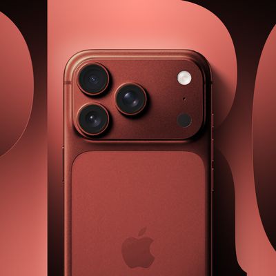
It is now mid-July, and that means the iPhone 18 Pro and iPhone 18 Pro Max are now just two months away. The devices are expected to look similar to the iPhone 17 Pro and iPhone 17 Pro Max, but there will still be many year-over-year changes, with rumored features including a smaller Dynamic Island, 5G via satellite, and more.
Apple is expected to unveil the iPhone 18 Pro, iPhone 18 Pro Max, ...