Jony Ive Put Apple's Marketing Team in Charge of iOS 7 Icon Design
 The Next Web has given us a peek behind the scenes at the development of the new and controversial user interface in iOS 7.
One of the more revealing points in the piece is that Jony Ive, recently put in charge of software as well as hardware design, tapped Apple's marketing and communications team -- MarCom -- to design the look and feel of the icons. Then, with those as a guide, the iOS design teams went to work.
First of all, many of the new icons were primarily designed by members of Apple’s marketing and communications department, not the app design teams. From what we’ve heard, SVP of Design Jony Ive (also now Apple’s head of Human Interaction) brought the print and web marketing design team in to set the look and color palette of the stock app icons. They then handed those off to the app design teams who did their own work on the ‘interiors’, with those palettes as a guide.
The site
goes on to note that the design is "firmly a 'work in progress'", and that the look and feel of the icons and other new UI bits are likely to change significantly as the iOS 7 beta proceeds.
Popular Stories
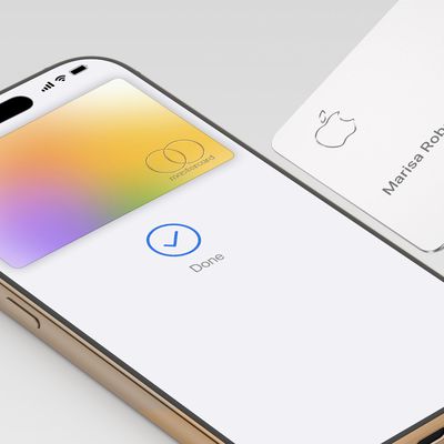
Starting as early as next week, customers who sign up for an Apple Card at Apple's retail stores in the U.S. will receive $249 cash back when they purchase AirPods Pro 3, according to Bloomberg's Mark Gurman. The promotion has yet to be officially announced by Apple, so exact terms and conditions are not available at this time.
AirPods Pro 3 are priced at $249 in the U.S., so customers who...
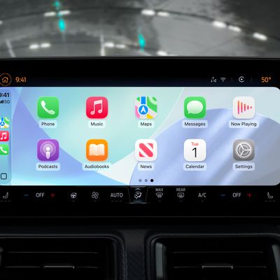
Apple's CarPlay system for accessing iPhone apps on a vehicle's dashboard screen has received six popular apps in recent weeks: ChatGPT, Perplexity, Grok, Google Meet, WhatsApp, and the indie artist streaming platform Audiomack.
Make sure you have the latest version of each app and they will automatically appear on CarPlay.
ChatGPT
Starting with iOS 26.4, CarPlay supports voice-based...
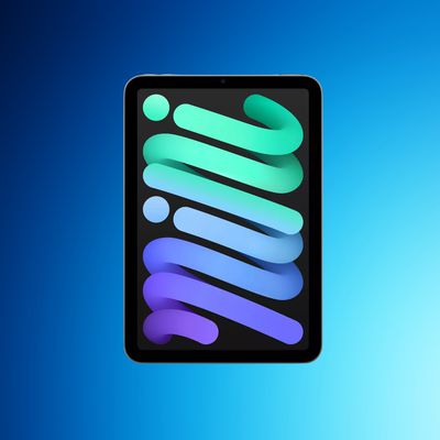
According to the latest rumors, Apple is close to launching its next-generation iPad mini. So what should we expect from the successor to the iPad mini 7 that Apple released over a year ago? Read on to find out.
Processor and Performance
Apple is working on a next-generation version of the iPad mini (codename J510/J511) that features the A19 Pro chip, according to information found in code...