iOS 7.1 Beta 3 Tidbits: Revamped Keyboard, Darker Icons, New Phone Look, and More - MacRumorsOpen MenuShow RoundupsShow Forums menuVisit ForumsOpen Sidebar
Skip to Content

iOS 7.1 Beta 3 Tidbits: Revamped Keyboard, Darker Icons, New Phone Look, and More

Earlier today, Apple released the third beta of iOS 7.1 to developers, which included both bug fixes and a number of visual changes that give several aspects of iOS 7 an entirely new look and feel. For example, the Phone dialer has been revamped with new buttons and several icons have had their color toned down, making iOS 7 less neon.

We've rounded up all of the visual changes that have been found in the iOS 7.1 beta thus far, creating an overview of what iOS 7 might look like in just a few months if the revisions make it into the final public release.

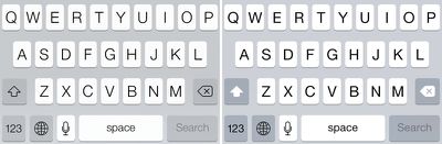
Keyboard: The keyboard in iOS 7 has been slightly revamped, adding a slight boldness to the font and a new design to the delete and shift keys. It also incorporates a somewhat darker, less yellow gray tone. Overall, the keyboard changes have the effect of adding contrast and making the letters easier to see.

ios71keyboard

iOS 7 keyboard on the left, iOS 7.1 keyboard on the right

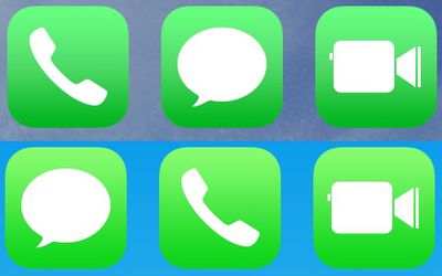
Icons: The green color in the Phone, Messages, and FaceTime apps has been toned down and is now darker, especially at the bottom of the icons. This introduces a less neon coloration to iOS 7, cutting down on some of the operating system's brightness.

newios7colors

Darker iOS 7.1 icons on the top, brighter iOS 7 icons on the bottom

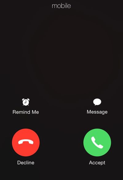
Phone: The Phone app has seen the biggest changes, with a renewed focus on simple, circular buttons. The standard incoming call screen with rectangular buttons has been replaced with a black background and two round Accept and Decline icons.

incomingcall

New incoming call buttons

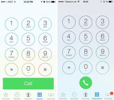
The "Call" and "End" buttons visible on the dialer have also been replaced with circular icons.

phonedialer

iOS 7 dialer on the left, iOS 7.1 dialer on the right

Wallpaper: When selecting a new wallpaper, users can now choose to turn the parallax effect on or off.

Control Center: Control Center's brightness and volume sliders now maintain momentum when they are flicked, a new feature that fits in well with a previous bounce animation added in iOS 7.1 beta 2.

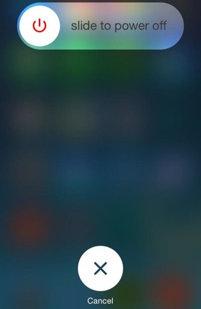
Shut down: The power off screen when shutting down the phone has a new look that does away with the red "slide to power off" and cancel tabs first introduced with iOS 7. The new design includes a power button icon at the top and a cancel icon at the bottom.

slidetopoweroff

Slide to Power Off in iOS 7.1

Accessibility: A New option has been added in the Accessibility's Contrast menu, allowing users to reduce iOS 7's white point. This feature joins both the "Button Shapes" and Darken Colors options that were added in an older iOS 7.1 beta.

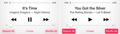
Music: The Music app has new shuffle and repeat buttons that are more prominent, and iTunes Radio has a revamped "New" button.

musicios71

iOS 7 buttons on the left, iOS 7.1 buttons on the right

According to a recent report from BGR, iOS 7.1 may not make it to consumers until March, indicating that the software will see a lengthy beta testing period. Beta 3’s release notes indicated a number of known issues that remain with iOS 7.1, suggesting that the update is not yet ready for the public.

Related Forum: iOS 7

Popular Stories

iCloud iPhone 17 Pro

iPhone Users Who Pay for iCloud Storage Get Two New Perks on iOS 27

Thursday July 2, 2026 6:10 am PDT by
If you pay for certain iCloud+ storage plans beyond the 5GB that Apple offers for free, you will receive two more perks on iOS 27 at no additional cost. A summary of the two new iCloud+ perks on iOS 27:Increased daily usage limits for some new Apple Intelligence features, including image generation in the revamped Image Playground app. HomeKit Secure Video cameras receive generated video...
Apple Event Logo

Apple Just Released a New Product

Thursday July 2, 2026 8:04 am PDT by
Apple's first product release of summer 2026 occurred this week, but do not get too excited, as it is merely the Beats Solo Buds in a new color. Beats Solo Buds are now offered in orange through Best Buy in the U.S., with availability set to expand to 7-Eleven stores in Japan on July 4. Apple already offered orange Solo Buds in India for free with the purchase of an iPhone 15 or iPhone 15 ...
iPhone 4 on Black Feature

Apple Facing One of Its Worst Leaks Since the iPhone 4

Thursday July 2, 2026 9:53 am PDT by
Apple supplier Tata Electronics recently suffered a cyberattack that resulted in thousands of confidential files being published on the dark web, and this reportedly included some photos and documents related to the upcoming iPhone 18 Pro. We have elected not to share any of the leaked photos in this story due to the illegal nature in which they were obtained, but they can easily be found...

Top Rated Comments

163 months ago
Not really digging the smaller 'call' button...

Everything else is ok though.
Score: 57 Votes (Like | Disagree)
163 months ago
REALLY hate that shut off screen, very horrible to look at, looks like a cheap/rushed theme.
Score: 34 Votes (Like | Disagree)
163 months ago
get back to me when there's some news on stability and usability. seriously? a slightly different hue of green? unreal.
Score: 32 Votes (Like | Disagree)
163 months ago
Ew at everything.
Score: 27 Votes (Like | Disagree)
bushido Avatar
163 months ago
those random big circles on the dialer and call screen give me OCD. seem so out of place and remind me of that horrible facebook home launcher on android ^^
Score: 24 Votes (Like | Disagree)
163 months ago
wow !

and nobody thought apple could innovate! :D


seriously though these changes are so minor it's a joke.

Apple needs to take a cue from Google and push larger changes on a more frequent manner.
Redesigning the entire operating system apparently isn't "big" enough. While Google's been sitting on Android 4.X for years now.

Yep, you're so totally right. Not saying 4.1-4.4 haven't included some neat features, but they've slowed down substantially since releasing 4.0. Mainly because they found a good design and didn't want to fix something if it wasn't broken. You know, kinda like Apple did from iOS 1-6. And now that they HAVE done a substantial overhaul with an entirely new design personality as well as some substantial and incredibly powerful new APIs, you're saying Apple isn't "pushing larger changes"

Lol.
Score: 22 Votes (Like | Disagree)