Original 1978 Apple Computer Retail Sign With Iconic Rainbow Logo Being Auctioned Off
An original Apple Computer Inc. sign created around 1978 with Apple's well-known rainbow logo is set to be auctioned off later this week.
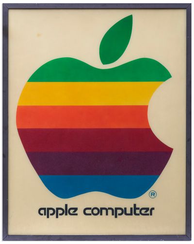
Measuring in at four feet by five feet, the sign is said to be one of the earliest Apple retail signs and was displayed by an Apple authorized reseller who first learned about Apple after attending a 1976 computer conference.
The sign is yellowed and the description says there are "a few surface marks," but overall, the rainbow colors are said to be bright and in good condition. The sign will be auctioned by Nate D. Sanders Auctions on March 26, and the starting price is $20,000.
Popular Stories
Bloomberg's Mark Gurman has high expectations for Apple's first foldable iPhone.
In his Power On newsletter today, he said the foldable iPhone will be "the most significant overhaul in the iPhone's history."
"iPhone 4, iPhone 6 and iPhone X were clearly a big deal, but this is a whole new design," he said.
Like Samsung's Galaxy Z Fold 7, the foldable iPhone will reportedly open up like ...
iOS 26.5 is now available for developers, and while it doesn't include any new Siri capabilities, there are some major changes for the European Union, and smaller tweaks for features available worldwide.
Suggested Places
In the Maps app, there's a new "Suggested Places" feature that recommends locations to visit based on trending places nearby and recent searches. When Apple launches ads in ...
Apple today added the MacBook Air (13-inch, 2017) to its "vintage" products list, meaning the device is now only eligible for repairs at Apple Stores and Apple Authorized Service Providers if parts remain available.
The MacBook Air (13-inch, 2017) was the final MacBook Air model released before Apple redesigned the laptop and gave it a Retina display in 2018.
Apple also added all iPad...