Apple is continuing to tweak the way that the Liquid Glass design looks ahead of the iOS 26 launch, and the latest beta makes a change to the Lock Screen.
The Lock Screen clock has been updated with additional transparency, allowing more of the background to peek through.
Beta 6 on left, beta 5 on right
The clock also has more of a 3D, floating look, which is in line with the rest of the Liquid Glass design. Apple didn't change the Liquid Glass look of the control buttons, but the icons are larger. Lock Screen widgets haven't changed.
Beta 6 on left, beta 5 on right
With the updated floating design and added translucency, the clock can be somewhat harder to see on certain darker backgrounds, but it is definitely more of a Liquid Glass aesthetic.
Apple has been tweaking different iOS 26 design elements throughout the beta testing process as it aims to perfect Liquid Glass before the iOS 26 debut in September.
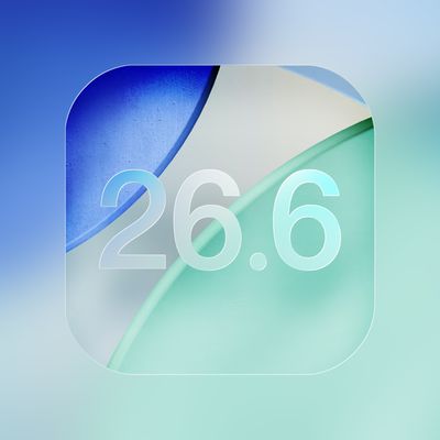
Apple today provided public beta testers with the second betas of iOS 26.6, iPadOS 26.6, macOS Tahoe 26.6, watchOS 26.6, and tvOS 26.6, with the software coming a day after Apple seeded the betas to developers and three weeks after the first public betas.
After signing up to beta test the software updates on Apple's beta site, public beta testers can download the new software using the...
Apple today seeded the second betas of upcoming iOS 26.6 and iPadOS 26.6 updates to developers for testing purposes, with the software coming three weeks after Apple seeded the first betas.
Registered developers can download the betas from the Settings app on the iPhone or iPad by going to the General section and selecting Software Update.
With iOS 27 set to launch in September, Apple is...
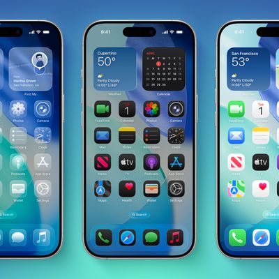
Apple has shared updated iOS 26 and iPadOS 26 adoption figures, revealing how many iPhones and iPads were running those software versions on the day before the start of WWDC 2026 and the release of the first iOS 27 developer beta.
These adoption numbers are based on iPhones and iPads that transacted on the App Store on Sunday, June 7, according to Apple.
The statistics are as follows:86%...
I'm really not sure why this needs to keep being reiterated, but here we go again: the BEFORE image always goes on the LEFT, the AFTER goes on the RIGHT. Just like how we read english text, from left to right. Understand?
I fear this whole design is a failure and Apple is heading into a dead end. Much too complex to manage properly. As much as I love the idea, it might make sense in specific situations but not for the whole OS. Apple tried translucent UIs with Aqua (translucent menus) and quickly reverted back. Unreadable text and blurry UI just doesn't make sense.
Apple's first foldable iPhone, with a book-style design featuring a ~5.5-inch outer display and a ~7.8-inch inner display with a minimal crease down the middle.

 Beta 6 on left, beta 5 on right
 Beta 6 on left, beta 5 on right