iOS 26 Beta 2 Fixes Frustrating Safari Design - MacRumorsOpen MenuShow RoundupsShow Forums menuVisit ForumsOpen Sidebar
Skip to Content

iOS 26 Beta 2 Fixes Frustrating Safari Design

In iOS 26 beta 2, Apple updated the location of the new tab icon in Safari, fixing a frustrating change that was made in the first ‌iOS 26‌ beta.

safari design changes ios 26 b2
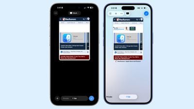
Safari in beta 2 on left, Safari in beta 1 on right

The initial ‌iOS 26‌ release introduced three view options for the tab bar and it changed the look of the interface for managing all open tabs. The tab view significantly altered the placement of buttons, including the "+" button for a new tab.

Apple moved the button from the bottom of the Safari interface in iOS 18 to the top in ‌iOS 26‌, which led to people tapping the wrong buttons when trying to open a new tab. There was no logical reason for the "+" button to move to the top of the screen, and in ‌iOS 26‌ beta 2, Apple moved it back to the bottom of the app.

The Safari tab management interface in ‌iOS 26‌ beta 2 is now similar to the tab management interface in iOS 18. The new tab option is on the left where it always was, and while "Done" is now a checkmark, it's still there on the right.

Apple kept the option to swipe between standard browsing, private browsing, and tab browsing, rather than tucking those away behind a hamburger menu. Options for managing tab groups, selecting tabs, and copying links remain in the top left.

‌iOS 26‌ beta 2 makes another small change to Safari, for those who opt to use the new "Compact" Safari tab view. With the Compact setting, if you tap on the back button, the button now splits into a forward and a back button for easier navigation. Before, there was no forward button option.

The top and bottom layouts have not changed, and have always had both the forward and back buttons.

Related Roundups: iOS 26, iPadOS 26
Related Forum: iOS 26

Top Rated Comments

10 months ago
This has driven me crazy in beta 1.
Repositioning UI elements that have been there for at least a few iOS iterations seems like a solution in search of a problem.
Score: 10 Votes (Like | Disagree)
10 months ago
Hey MacRumors, why does this screenshot show beta 2 on the left and beta 1 on the right?
This article earlier today had them the other way around: https://www.macrumors.com/2025/06/23/ios-26-b2-control-center/
Can we get some consistency? 😉
Score: 7 Votes (Like | Disagree)
jclardy Avatar
10 months ago

This has driven me crazy in beta 1.
Repositioning UI elements that have been there for at least a few iOS iterations seems like a solution in search of a problem.
Also just an insane UX decision. Moving the most used button on this screen to the top of the screen makes no sense. Glad they changed it.
Score: 4 Votes (Like | Disagree)
orbital~debris Avatar
10 months ago
Always find it bizarre when the old is on the right, and the new is on the left.
Score: 4 Votes (Like | Disagree)
zakarhino Avatar
10 months ago
Much better, now just flip the new tab button and the useless tick button which closes the tab overview display
Score: 4 Votes (Like | Disagree)
Kramerjn Avatar
10 months ago

Easiest (new) way is to swipe left on the address bar to open a new tab. No +-button needed!
If you happen to be on your last tab, otherwise it just switches tabs like before. I'm also not entirely sure that it's new, I think I was able to do that on iOS 18, but I could be wrong about that.
Score: 3 Votes (Like | Disagree)