Apple Offers Safari Design Choices in iOS 26, Learning from Past Criticism - MacRumorsOpen MenuShow RoundupsShow Forums menuVisit ForumsOpen Sidebar
Skip to Content

Apple Offers Safari Design Choices in iOS 26, Learning from Past Criticism

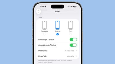
Apple introduced a new, compact design for Safari in iOS 26 that serves as the default layout, but there are two other design options available if you don't like it.
ios 26 safari options
In the Safari section of the Settings app, you can select Compact (the default), Bottom, or Top. The latter two are the options in iOS 18, so ‌iOS 26‌ uses that same layout, but with a tweaked design to match the Liquid Glass aesthetic.
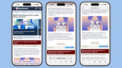
ios 26 safari design light modeThe three Safari Tab options in ‌iOS 26‌, Light Mode

Functionally, the Bottom and Top Tabs operate in the same way as the Safari Tab bars in iOS 18, so you don't need to change anything about how you use Safari. The Compact option hides the share, bookmark, and tab settings behind the three-dot button on the left of the URL bar.
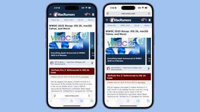
ios 18 safari designSafari in iOS 18

The Liquid Glass translucent design blends the URL bar and buttons into the background of the webpage you're looking at regardless of what layout you choose. The effect is similar in both Light and Dark mode, with the color of the bar determined by the webpage's content.
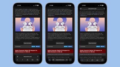
ios 26 safari design dark modeThe three Safari Tab options in ‌iOS 26‌, Dark Mode

When you scroll down with any of the Tab settings, the URL bar and buttons collapse down into a single, small bar with just the webpage address listed. The collapsible bar allows you to see more of the webpage without distractions.
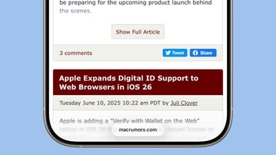
ios 26 safari menu collapsedCollapsed Tab Bar in ‌iOS 26‌

Back when iOS 15 was in beta testing, Apple changed the design of Safari and did not initially provide different layout options for the URL bar. Apple received negative feedback throughout the beta testing process, and ultimately implemented options to revert to the original design. This time around, Apple has learned its lesson, and has provided users with more choice for the Safari layout.
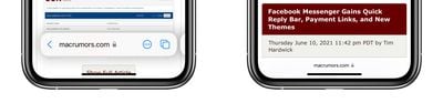
safariThe iOS 15 Safari Tab Bar

Apple has actually offered design choices for several of the ‌iOS 26‌ design updates that could be controversial. The Phone app offers a unified view, for example, but by default, it's not implemented. There are also glass-like icons that can be selected, but they're also not the default option.

Related Roundups: iOS 26, iPadOS 26
Tag: Safari
Related Forum: iOS 26

Popular Stories

iOS 26 6 2

Apple Releases iOS 26.6.2

Tuesday September 8, 2026 10:47 am PDT by
Apple today released iOS 26.6.2 with a fix for "an issue that prevents downloading a software update over a cellular connection." The minor software update is rolling out now for the iPhone 11 series and newer. To update your iPhone, open the Settings app and tap on General → Software Update. It might take a few minutes for the update to be visible to everyone. iOS 26.6.2 arrives...
ios 26 7

Apple Releases iOS 26.7 With Security Fixes

Monday September 14, 2026 10:32 am PDT by
Alongside iOS 27, Apple today released iOS 26.7, an update to the existing iOS 26 software. Users who check for new software will see iOS 26.7 as the default update, with iOS 27 listed as an option at the bottom of the Software Update interface. According to Apple's release notes, iOS 26.7 includes security fixes, but it does not have any other features. Apple will eventually show iOS 27 ...
apple lock security bug vulnerability fix privacy

iOS 27 and iOS 26.7 Fix More Than 100 Security Bugs

Monday September 14, 2026 11:36 am PDT by
Today's iOS 27 update addresses over 100 security vulnerabilities, which is a good reason to install the new software. If you don't want to update to iOS 27 yet, Apple also released iOS 26.7 with over 80 security fixes. 75 of the fixes are shared across both updates, so iOS 26.7 addresses many of the same issues. There are multiple kernel fixes, including one that could allow a malicious...

Top Rated Comments

17 months ago
liquid glass looks horrible. Why does the whole page blur when near the edge, even if not covered by the floating tab?


Attachment Image
Score: 20 Votes (Like | Disagree)
17 months ago
I’m leaving this comment for all those who like the fact that we have an option. Score one for the good guys!

Now, I’ll sit back and wait for a thumbs down vote for those who don’t like the fact we have options.
Score: 19 Votes (Like | Disagree)
17 months ago
I hated the tabs on bottom layout when it first came out and avoided using it for years.

I eventually decided to give it a try again on a trial basis — use it for a week, and if I still hated it, revert. I never went back to tabs on top after that.
Score: 18 Votes (Like | Disagree)
klasma Avatar
17 months ago
I dislike floating elements though. It's unfortunate that all three options have them.
Score: 13 Votes (Like | Disagree)
kurtfoster Avatar
17 months ago
I for one, prefer the address bar at the top. That’s how it’s always been for me, and it’s what I’m used to. Also, I’m too old to change. Hopefully that will continue to be a choice.
Score: 11 Votes (Like | Disagree)
17 months ago
This design has terrible UX. The entire web is not going to reformat to use safe area insets. If this makes it to the broad public this Fall, people are going to flip their gourd.
Score: 10 Votes (Like | Disagree)