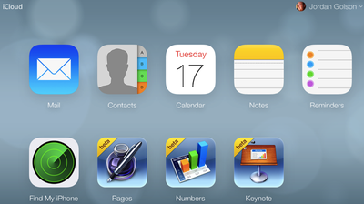
iCloud.com has received a makeover with new icons and design inspired by iOS 7, after previously rolling out to beta customers back in August. The background wallpaper mirrors the dynamic, slowly changing wallpaper offered in iOS 7 as well.
The site is using new icons for Mail, Contacts, Calendar, Notes, Reminders and Find My iPhone; while iWork for iCloud is still using the older-style iWork for iOS icons.
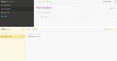
The apps -- with the exception of iWork -- have all received extensive redesigns as well, using lighter pastel colors and slimmer fonts.
Sunday September 13, 2026 3:00 am PDT by Eric Slivka
Update 10:04 a.m.: iOS 27 is rolling out now, though it may take a bit for all users to see it, so keep checking!
Apple is about to release iOS 27, which will finally deliver more advanced Siri AI capabilities as well as a variety of other refinements, improvements, and new features to iPhones. It's Apple's biggest software update of the year, and Apple announced at Wednesday's iPhone event...
Monday September 14, 2026 9:00 am PDT by Joe Rossignol
Update — 10 a.m. Pacific Time: Apple has released iOS 27.
During its iPhone 18 Pro and iPhone Duo event last week, Apple announced that iOS 27 will be released widely on Monday, September 14.
iOS 27 should be available around 10 a.m. Pacific Time / 1 p.m. Eastern Time today via the Settings app, under General → Software Update.
Below, we have highlighted eight new features and...
Tuesday September 15, 2026 1:43 am PDT by Tim Hardwick
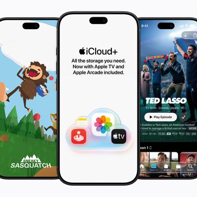
Apple today announced a new subscription initiative that turns paid iCloud+ subscriptions into a broader services bundle in more than 100 countries.
In select countries, Apple says every paid iCloud+ plan, including the cheapest 50GB tier, now includes Apple TV and Apple Arcade "at no additional cost," while family sharing extends the storage, TV and Arcade access to up to five people....
I must be on my own, but I still find the design style of iOS7 to be off putting and unrefined. Not that I preferred the look in iOS6, I didn't - a change was most definitely necessary - I just think Apple missed the mark on this.
Seriously, I can't wait for Apple bringing back shadows and gradients, followed by usability and taste. Let's give them about 5 years.... If that's the future of OS X, I need to go look for something else in the meantime…
C'mon, using some pseudo-fancy style of Helvetica and random icons doesn't make a user interface as expected from Apple...
Never thought I'd miss linen in my life, but this is just tragic. I'm glad to see that many agree. I like the overall look of iOS 7, but this looks like Microsoft trying to copy it
For those looking around Elementary/Ubuntu (http://elementaryos.org) is looking pretty good these days.
What it lacks is what we're looking at here - Apple's ecosystem, which sadly, requires OS X.
I don't like the way OS X is heading, either - iOS is deliberately limited because the processors can't handle a full OS, and that just happens to be good for beginners, but that's no reason to dumb down OS X.
Sadly OS X was never as user friendly as the Mac OS, and I'm almost glad they took the Mac off Mac OS X, because it never came close to Mac intelligence. If you came from Windows you wouldn't know, but fiddlying text files is 1960s technology (as is unix, yes I know Elementary is Unix). Mac had a gui for everything but machine code.
It's the little things, like opening an app and putting into the background because it's going to take a while to start up, and having the ****** app stay there until I ask for it again. Only OS X could give us backgrounded apps jumping to the front on a Mac.
Or how about actually calculating folder sizes in a list view (I have a thunderbolt drive that does that, but nothing Apple ships does it).
And the disturbing trend - opening multiple Tabs in the background in Safari, and finding they don't actually load until you switch to each tab - iOS comes to OS X in the worst possible way.
Disturbing as yellow on white is (and it truly is Microsoft-level clueless), Mac owners have much more to worry about.