macOS 15 System Settings to Get Design Overhaul - MacRumorsOpen MenuShow RoundupsShow Forums menuVisit ForumsOpen Sidebar
Skip to Content

macOS 15 System Settings to Get Design Overhaul

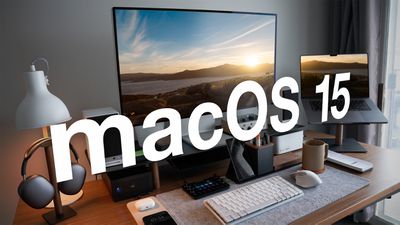
With the macOS 15 update that is set to debut at WWDC in June, Apple plans to rearrange "menus and app UIs," according to a report from AppleInsider. The System Settings app, which was last updated with macOS Ventura, will get one of the biggest updates.
macOS 15 Feature
With macOS Ventura, Apple renamed the System Preferences app to System Settings, introducing a design similar to the Settings app on the iPhone and iPad. System Settings in macOS 15 is said to feature a new organizational system based on "priority and overall importance."

The Notifications and Sound categories in System Settings will be moved lower in the list, with General settings moved up right under Network settings. Apple plans to move the existing Wallpaper and Displays sections into the same section with General settings, and Privacy and Security will be paired with Touch ID and Password and other relevant settings. Siri and Spotlight will be paired with Internet Accounts and Game Center.

Apple also reportedly plans to redesign the ‌Siri‌ menu bar icon, making a flat black and white icon to replace the current colorful icon, and there are said to be design changes coming to Calculator (a more iOS-like design) and Safari (a unified menu for page controls). Other rumored macOS 15 changes include a Printable Account Recovery Summary option, a new iCloud preference pane, and a "modern" user interface for AirDrop.

Apple's annual Worldwide Developers Conference keynote is set to take place on Monday, June 10, and it will see Apple unveil macOS 15, iOS 18, tvOS 18, visionOS 2, and watchOS 11.

Related Forum: macOS Sequoia

Popular Stories

iPhone 18 Pro Deep Red Feature

iPhone 18 Pro Launching in Two Months With These 12 New Features

Friday July 17, 2026 10:39 am PDT by
It is now mid-July, and that means the iPhone 18 Pro and iPhone 18 Pro Max are now just two months away. The devices are expected to look similar to the iPhone 17 Pro and iPhone 17 Pro Max, but there will still be many year-over-year changes, with rumored features including a smaller Dynamic Island, 5G via satellite, and more. Apple is expected to unveil the iPhone 18 Pro, iPhone 18 Pro Max, ...
iPhone 18 Pro and Pro Max Feature

'Apple Upgrade' Program Reportedly Launching Next Week

Tuesday July 21, 2026 8:30 am PDT by
Apple and Klarna are partnering on a new "Apple Upgrade" program set to launch in the U.S. on Tuesday, July 28, according to Bloomberg's Mark Gurman. The program will allow you to finance most iPhone, iPad, Mac, and Apple Watch models, with a 24-month term for iPhones and Apple Watches and a 36-month term for iPads and Macs. Customers will be able to pay off the device early during the term, ...
iPhone 18 Pro Deep Red Feature

iPhone 18 Pro Launching in Two Months With These 12 New Features

Tuesday July 21, 2026 6:22 am PDT by
It is now mid-July, and that means the iPhone 18 Pro and iPhone 18 Pro Max are now just two months away. The devices are expected to look similar to the iPhone 17 Pro and iPhone 17 Pro Max, but there will still be many year-over-year changes, with rumored features including a smaller Dynamic Island, 5G via satellite, and more. Apple is expected to unveil the iPhone 18 Pro, iPhone 18 Pro Max, ...

Top Rated Comments

tonywalker23 Avatar
28 months ago
Make it look like this: (credit to iSMH at 512 ('https://512pixels.net/projects/aqua-screenshot-library/mac-os-x-10-4-tiger/'))

Attachment Image
Score: 153 Votes (Like | Disagree)
mikethebigo Avatar
28 months ago
Thank goodness. Here's the leaked design.

MacRumors content image
Score: 113 Votes (Like | Disagree)
Avenged110 Avatar
28 months ago
Just moving options around the garbage iOS-style design isn't really going to fix that mess. Just bring back the proper System Preferences application.
Score: 73 Votes (Like | Disagree)
sniffies Avatar
28 months ago
It’d be nice to have quicker access to stuff like Hide My Email.

Currently, it’s at least 10,000 taps away.
Score: 52 Votes (Like | Disagree)
28 months ago
What Apple had in Big Sur and Monterey was fine… they ‘innovated’ themselves into a corner with Ventura. I for one hope they bring back what we had before… and please bring back the ability to rearrange the icons and let us sort by category or alphabetically. The haphazard mess that we have is unacceptable from the same company that produces the wonderful M4 and Tandem OLEDs. Let’s go Apple!
Score: 42 Votes (Like | Disagree)
DogHouseDub Avatar
28 months ago

It’d be nice to have a quicker access to stuff like Hide My Email.

Currently, it’s at least 10,000 taps away.
Only 10,000? Please share this efficient workflow!
Score: 39 Votes (Like | Disagree)